Interactive Reports
Interactive Reports
Transforming static background reports into a dynamic, real-time platform — Vcheck's largest product launch to date.
Transforming static background reports into a dynamic, real-time platform — Vcheck's largest product launch to date.
Company
Vcheck
Project Role
Content
Product Designer
Team
Content
3 Product Designers
1 VP of Product Design
3 Engineers
Year
Nov 2024-Mar 2026
Context
Context
Vcheck investigates people and companies before deals close.
PE firms, law firms, and financial institutions hire Vcheck to run background investigations before signing. 150+ investigators. 25,000+ reports a year. Every one delivered as a PDF.
Vcheck investigates people and companies before deals close.
PE firms, law firms, and financial institutions hire Vcheck to run background investigations before signing. 150+ investigators. 25,000+ reports a year. Every one delivered as a PDF.
Problem
Problem
Long static PDFS that were hard to navigate and long to verify.
Reports ran fifty pages or more. The biggest risks were surfaced up front but everything else required scrolling through pages to find each section. Beyond the length, three gaps had gone unsolved.
Long static PDFS that were hard to navigate and long to verify.
Reports ran fifty pages or more. The biggest risks were surfaced up front but everything else required scrolling through pages to find each section. Beyond the length, three gaps had gone unsolved.

Insight
Insight
No one reads these reports top to bottom.
Analysts jump straight to what matters for their deal. The PDF forced linear reading on a non-linear task. The goal became clear: build something that matches how analysts actually think.
No one reads these reports top to bottom.
Analysts jump straight to what matters for their deal. The PDF forced linear reading on a non-linear task. The goal became clear: build something that matches how analysts actually think.
Process
Process
Structure first, screens second.
Before wireframing, the team gathered references from products that handled risk hierarchies and data density well. Riskline, Prenuvo, Intercom, Zapier, Anthem. I helped pull and organize these references as we aligned on a direction.
Structure first, screens second.
Before wireframing, the team gathered references from products that handled risk hierarchies and data density well. Riskline, Prenuvo, Intercom, Zapier, Anthem. I helped pull and organize these references as we aligned on a direction.
Wireframes, iterations, and design reviews.
My main contribution early on was wireframing. Getting the risk summary, section nav, and finding detail to work together took a lot of iterations. The biggest call was whether the risk summary should be persistent or collapsible. We went with persistent — analysts need that headline count visible no matter where they are in the report.
I sat in on reviews with the VP of Product Design, PM, and stakeholders. Swipeable finding cards got added. Status filter tabs, avatar icons, and red color coding on negative values got cut. Every round made it more focused.
Building screens inside the design system.
Vcheck had a mature component library. My job was applying it consistently across 10+ section types and helping extend it where new patterns came up.
I sat in on reviews with the VP of Product Design, PM, and stakeholders. Swipeable finding cards got added. Status filter tabs, avatar icons, and red color coding on negative values got cut. Every round made it more focused.

Severity badges carry the whole visual risk language of the product. Red, grey, blue. They appear on nav indicators, card borders, and section headers. Consistency there is what makes the scanning experience work.
Severity badges carry the whole visual risk language of the product. Red, grey, blue. They appear on nav indicators, card borders, and section headers. Consistency there is what makes the scanning experience work.
The Final Product
The Final Product
We launched Interactive Reports.
Reports ran fifty pages or more. The biggest risks were surfaced up front but everything else required scrolling through pages to find each section. Beyond the length, three gaps had gone unsolved.
We launched Interactive Reports.
Reports ran fifty pages or more. The biggest risks were surfaced up front but everything else required scrolling through pages to find each section. Beyond the length, three gaps had gone unsolved.
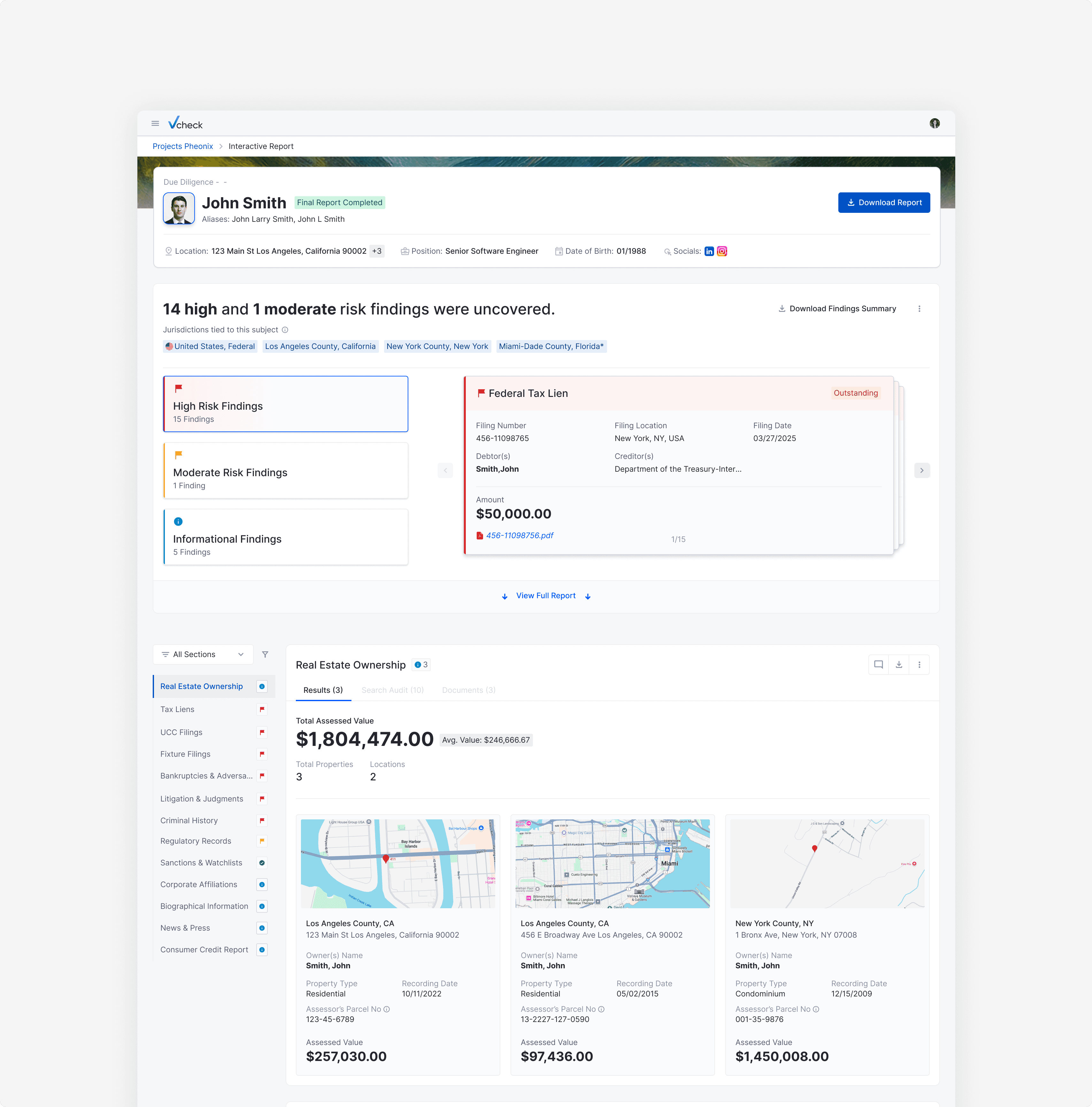
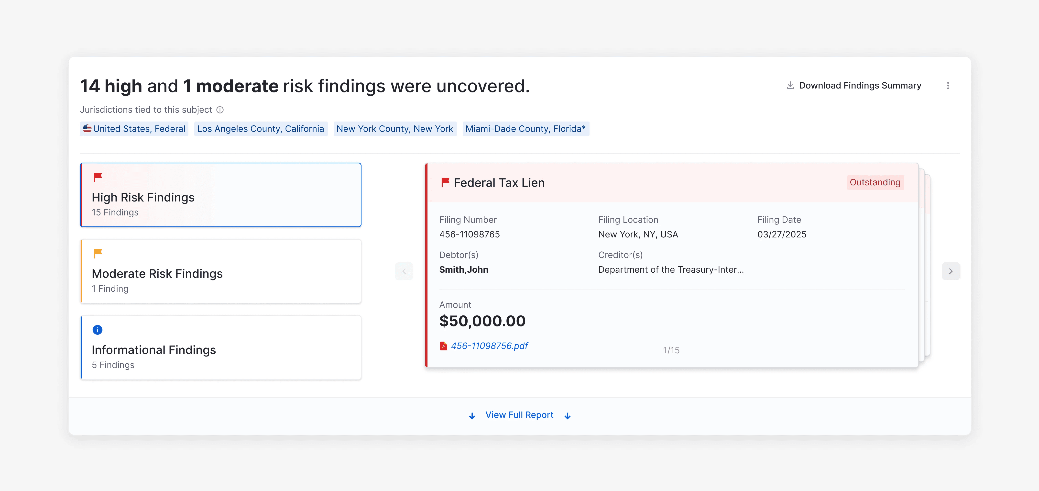
Risk is visible before you read a word.
The summary banner shows severity counts and the most critical finding inline. The left nav carries severity indicators on every section so analysts know where to go before clicking anything.
Risk is visible before you read a word.
The summary banner shows severity counts and the most critical finding inline. The left nav carries severity indicators on every section so analysts know where to go before clicking anything.
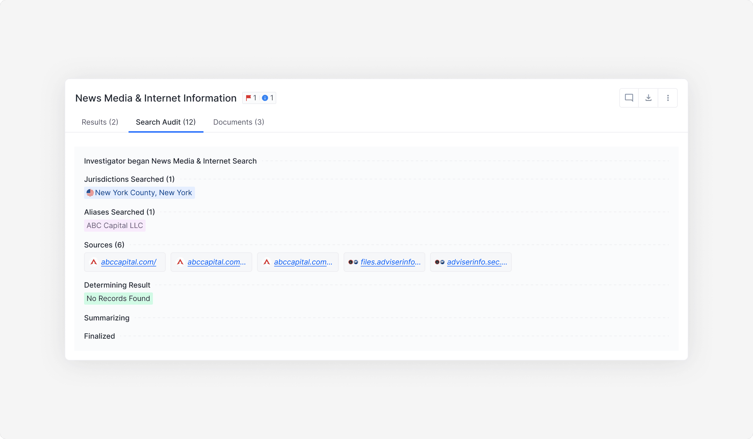
Every finding links directly to its source.
The Search Audit tab lives inside each section — documenting every jurisdiction searched and every source accessed, right next to the finding it supports. No appendix. No cross-referencing.
Every finding links directly to its source.
The Search Audit tab lives inside each section — documenting every jurisdiction searched and every source accessed, right next to the finding it supports. No appendix. No cross-referencing.
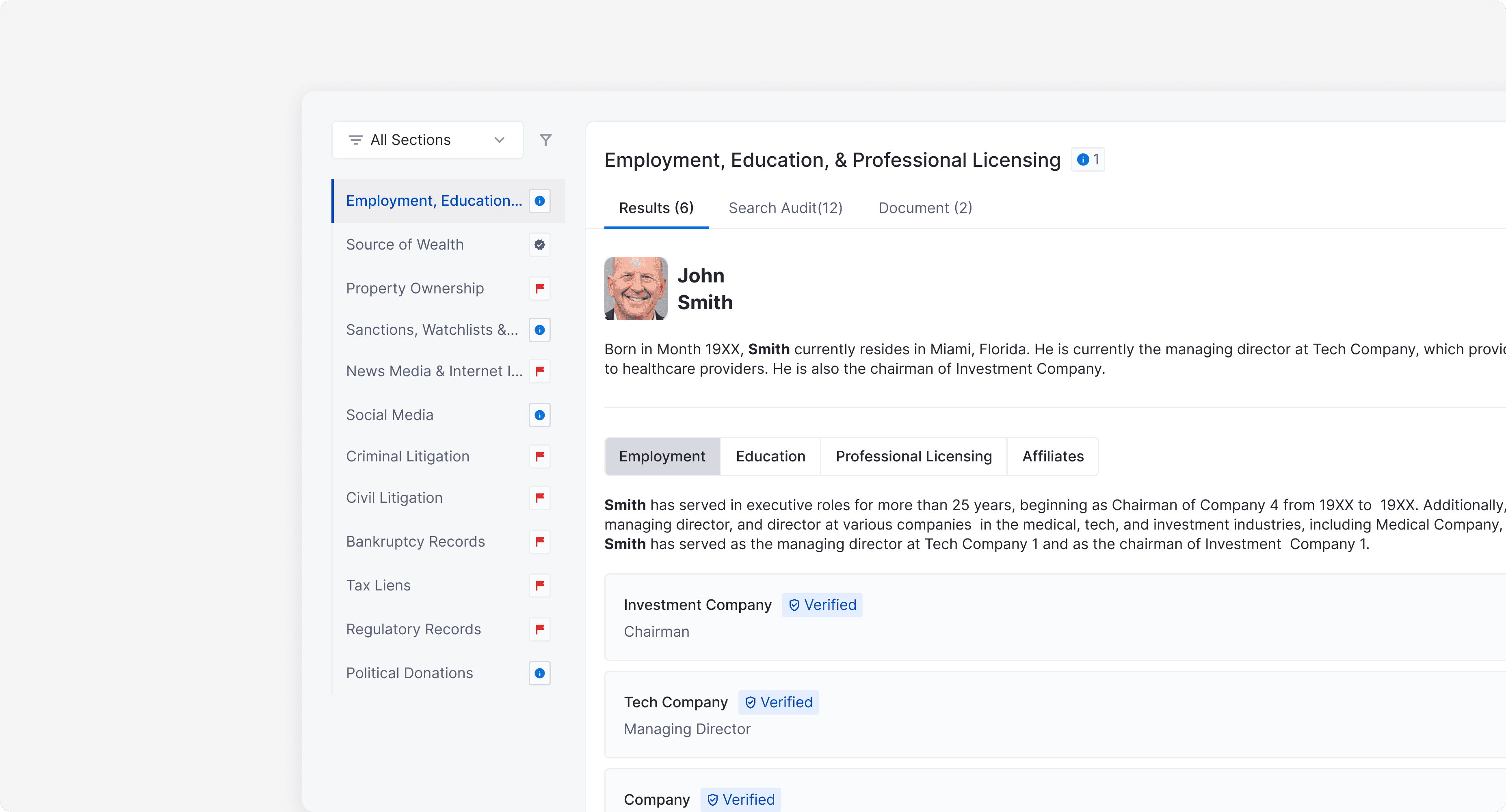
The data, without the document.
Finding cards surface status, creditor, amount, and filing date inline. Supporting documents are one click away. No PDF required to understand what happened.
The data, without the document.
Finding cards surface status, creditor, amount, and filing date inline. Supporting documents are one click away. No PDF required to understand what happened.

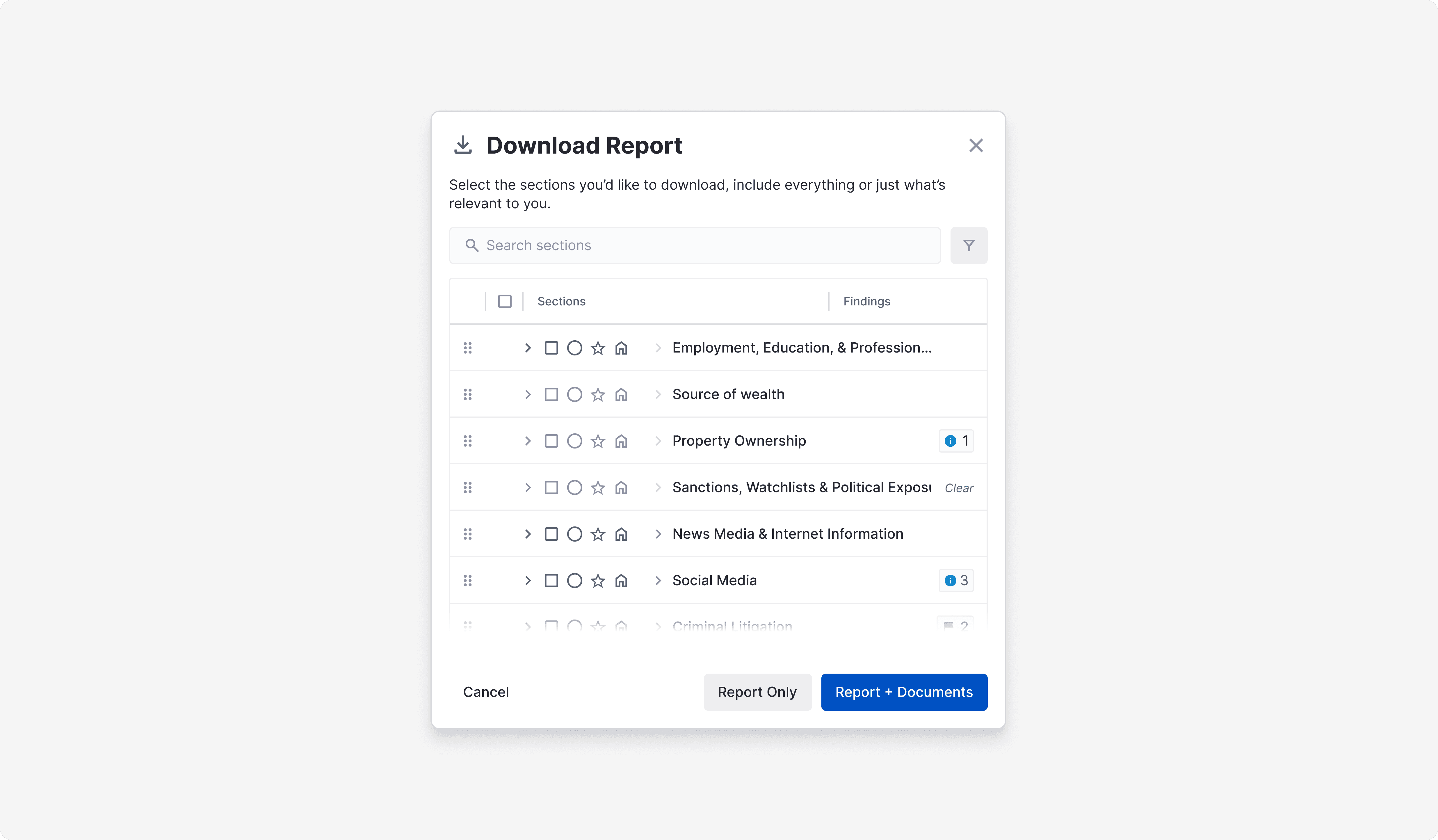
The PDF never went away.
Clients can still download a traditional PDF at any time. The Download modal lets them choose exactly which sections to include — everything or just what's relevant. Interactive Reports didn't replace the PDF. It gave clients a better way to work before they need one.
The PDF never went away.
Clients can still download a traditional PDF at any time. The Download modal lets them choose exactly which sections to include — everything or just what's relevant. Interactive Reports didn't replace the PDF. It gave clients a better way to work before they need one.
Reflection
Reflection
I was a supporting designer on a three person team.
In the first few weeks, the product launched to more than 50 firms, which made working on a live product team very different from anything I had done before. The work was not just about making good screens. It required understanding the system you are designing within, following a structured review process, and contributing meaningfully within an established product vision.
The design system was the biggest shift. Learning to design within constraints rather than around them made me a more precise designer. Sitting in review sessions and hearing experienced designers explain their decisions also helped deepen my understanding of product thinking in a way that no brief could.

