Spearheaded the UX redesign of Vcheck’s website contributing to 20,000+ active website users in three months.
Company
Vcheck
Project Type
UX Design, Marketing Design
Year
2024-2026

Mission
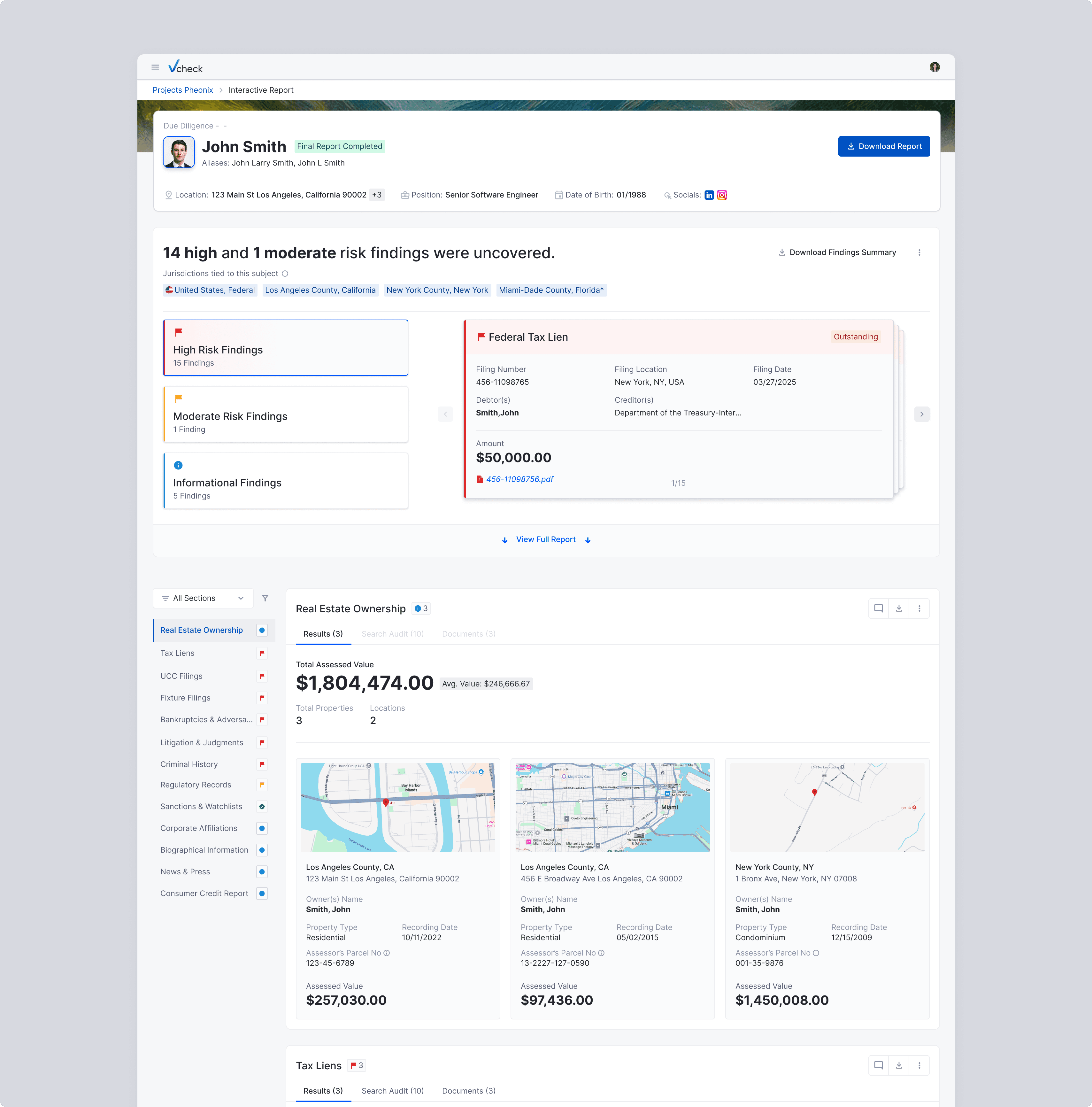
Before the Interactive Reports launch, Vcheck delivered background verification results as dense, static PDFs which were difficult to navigate, impossible to act on in real time, and inconsistent with the modern SaaS experience clients expected.
Process
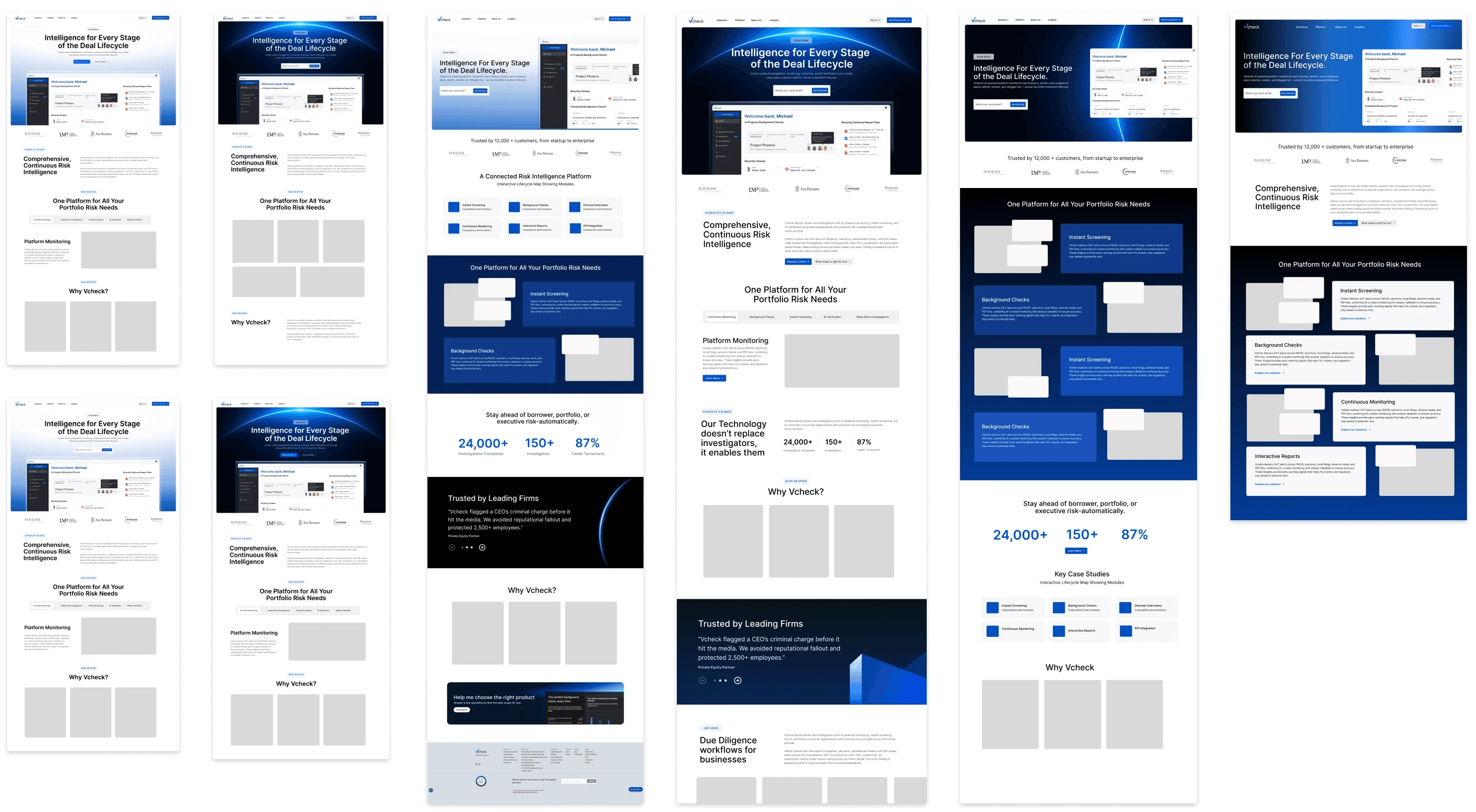
I led the redesign of Vcheck’s primary website to support the launch of Interactive Reports and better communicate the platform’s value. After analyzing the existing site and reviewing competitor products, I developed multiple wireframe concepts to explore layout and worked closely with product and web engineering.
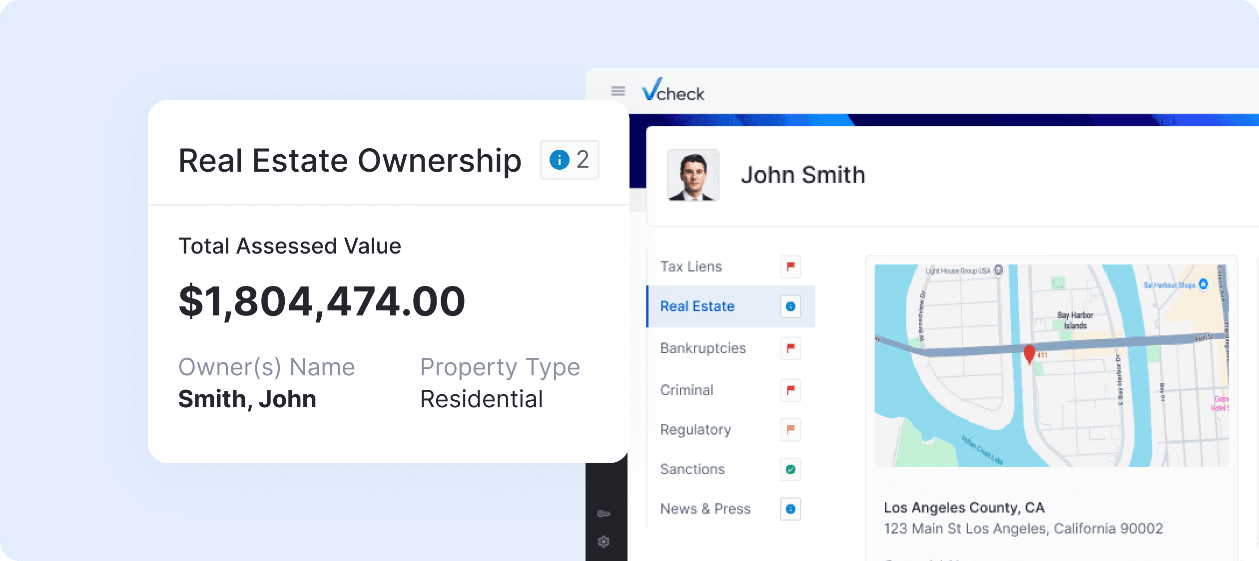
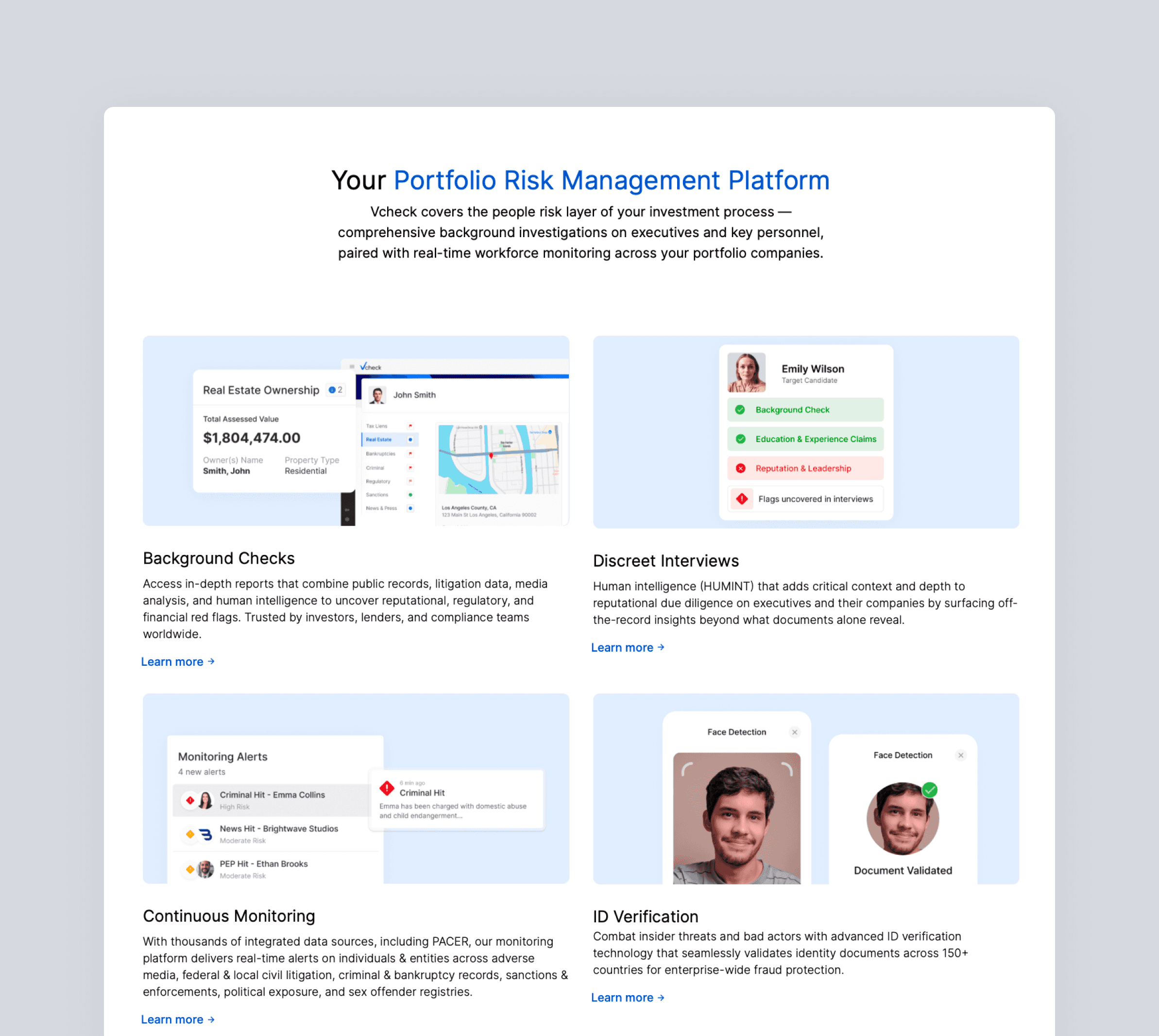
Interactive Report Experience
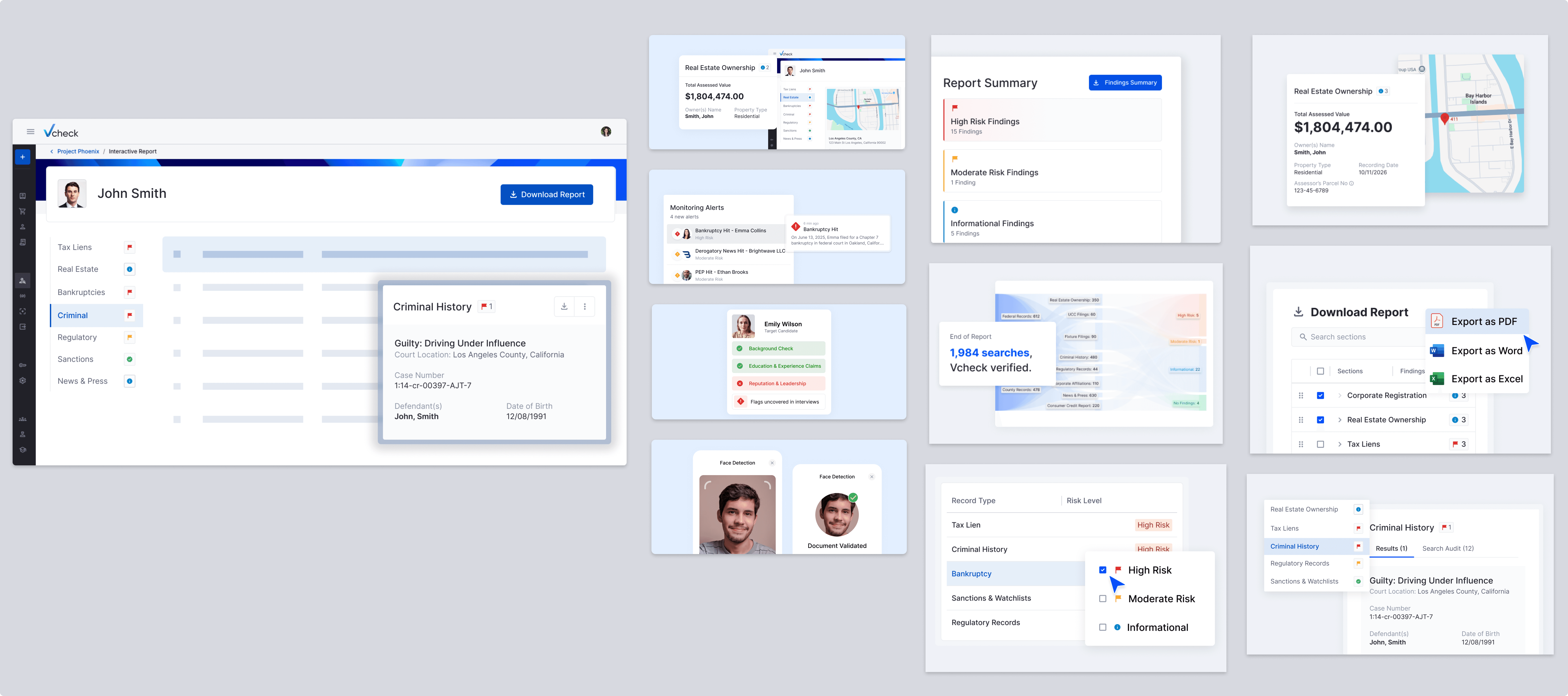
Alongside the website re-design, I designed key interface componenets for the interactive reporting experience itself. The new system highlights key risks upfront for quick review, organizes findings into clear sections with deeper detail, and lets users explore reports interactively or download the full report.
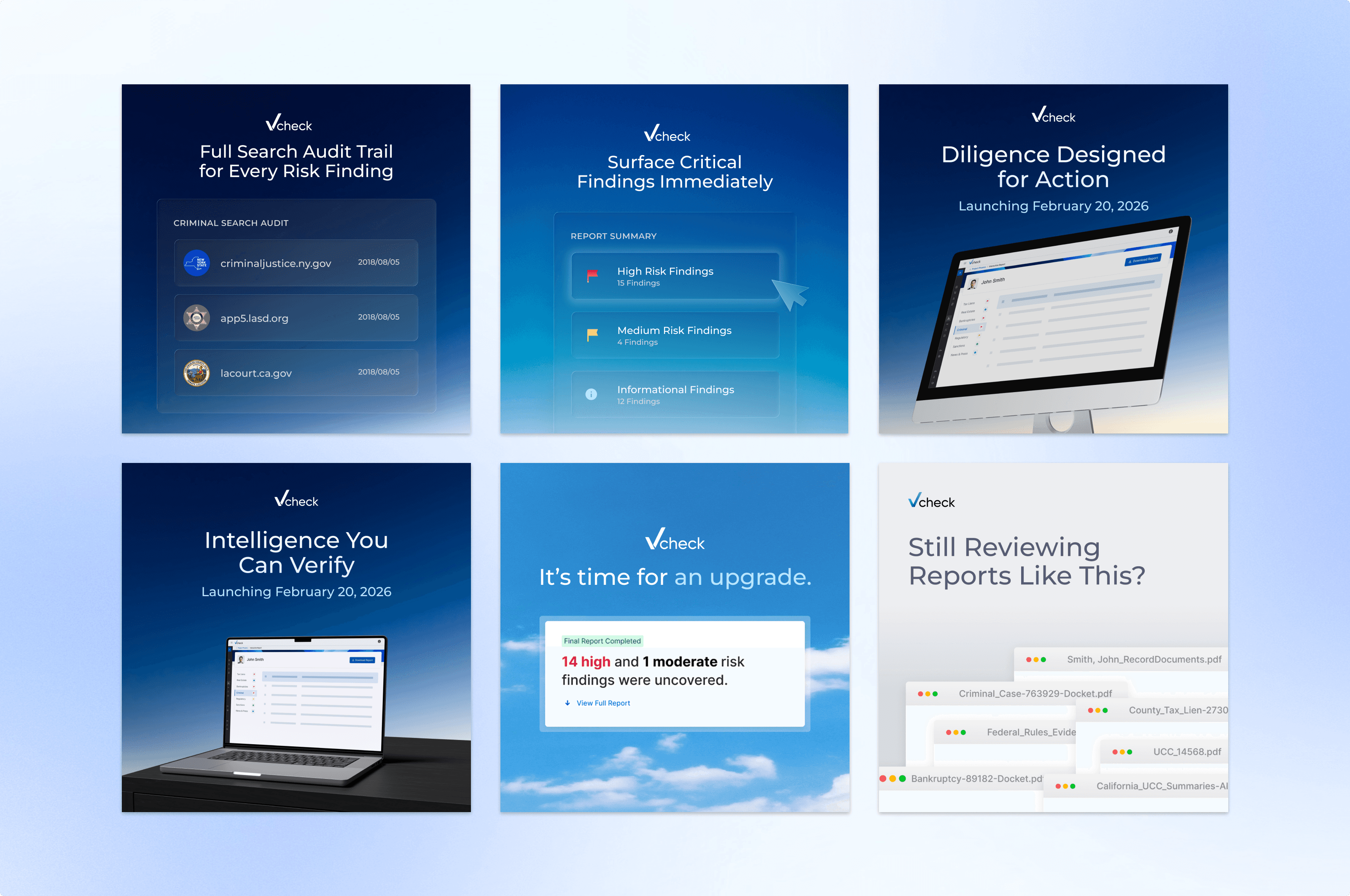
Assets
To support the rollout of the new platform, I developed a collection of visual assets used across product marketing and communications. These include interface visuals, UI component graphics, and platform imagery designed to highlight the clarity and depth of the new reporting system.
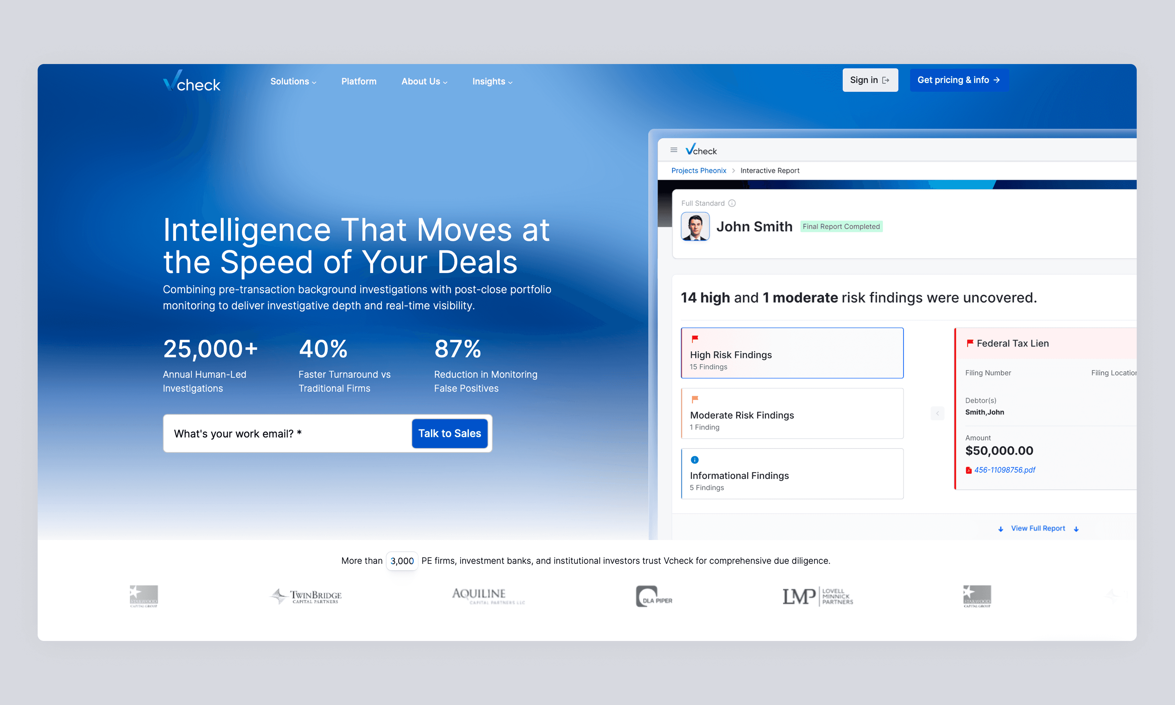
Vcheck Homepage Redesign
I led the redesign of Vcheck’s homepage alongside the launch of interactive reports and updated product assets. The goal was to clearly highlight Vcheck’s core product offerings, which the previous site did not communicate, and to position the brand as a modern SaaS company through a clean and structured layout.

Launch Campaign
To support the rollout of the new platform, I developed a collection of visual assets used across product marketing and communications. These include interface visuals, UI component graphics, and platform imagery designed to highlight the clarity and depth of the new reporting system.
Outcome
The redesign and launch of Interactive report significantly improved user engagement, attracting 20,000 website viewers in the past three months.

